


Most of the time when you see a picture of one of the plague of modern war shooters that has befallen us like so many locusts, the only way to identify it is the configuration of the heads up display.
 |
| Call of Duty? Bad Company 2? Medal of Honor? Who knows. |
 |
| From this... |
 |
| ...to this |
 |
| Yes I've used this image before, what of it? |
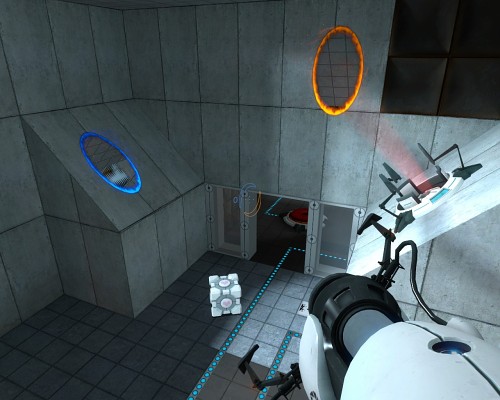
While Portal takes a minimalist approach to draw your attention to important objects, and avoid visual clutter infringing on gameplay.
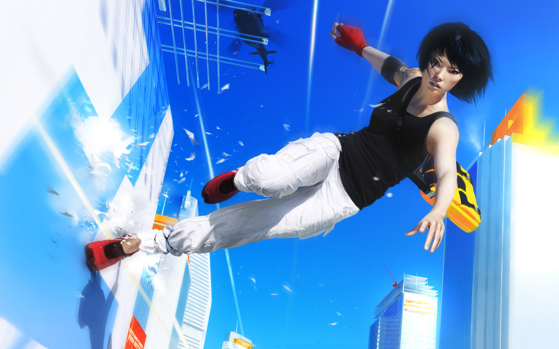
As you can see, art style and gameplay are inextricably linked: in a realistic shooter, you want the environment to look as realistic as possible, perhaps with some moody skies and lowered saturation to create a forboding atmosphere. In a Tolkien-esque fantasy world you want towering castles and gloomy dungeons.
Try this out next time you make a level: pick an art style and build a level around it. If you're short of appropriate textures, Interlopers and Half-Wit 2 (both linked at the bottom of the page) have tutorials on texture creation.
Happy mapping!
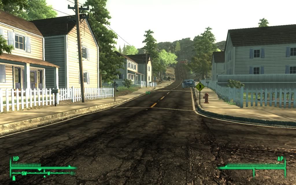
Pre-war Fallout 3 image courtesy of Lydia